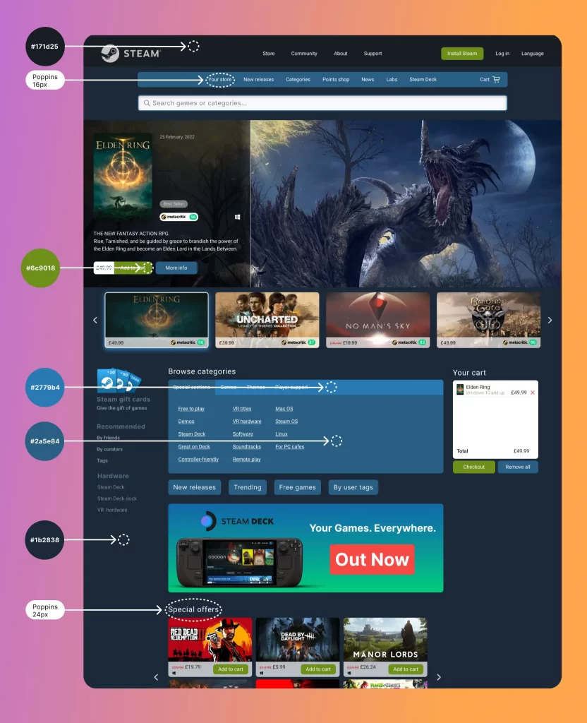
A redesign of the Steam homepage to enhance clarity and simplify the purchasing process.

I have redesigned the Steam homepage to be more visually appealing and user-friendly by decluttering the original layout. The addition of a constantly visible cart further streamlines the purchasing process, reminding users and allowing a quick-to-purchase method.
Cognitive load theory suggests reducing the amount of cognitive effort required to navigate a site can improve user performance and satisfaction.
Simplifying the checkout process by keeping essential elements visible can lead to higher conversion rates and improved user satisfaction.
Research from 2023 supports that integrating well-known review sources enhances credibility and user confidence in their purchase decisions

During the iterative design process of the Steam homepage redesign, I initially placed the search bar under the hero section. However, after user testing and feedback, I moved it to the top, directly under the navigation bar, to improve accessibility and visibility. Additionally, refining the hero section ensures consistency in the information displayed between different games. This redesign not only enhanced visual coherence but also allowed for more detailed and relevant game information to be prominently featured, capturing user attention more effectively.
The introduction of a sticky cart enhances the user experience by consistently reminding users of their desire to purchase and simplifying the checkout process. This feature ensures that users can easily review their selected items and proceed to purchase with minimal hassle.
Additionally, integrating a well-known review site provides users with valuable reassurance about their purchases, helping to build trust and confidence in their buying decisions.


Direct categories access
Moving the categories section from the left side menu directly in front of the user significantly improves ease of navigation. By placing the categories in a central location, users can quickly and easily move to their desired category, streamlining the browsing experience.
Additionally, tabbing the categories reduces cognitive load, making it simpler for users to find what they are looking for without feeling overwhelmed by too many options at once.
Enhanced search functionality
Enhancing the search functionality by making it bigger and more prominent allows users to easily search for their desired game. A more visible and accessible search bar ensures that users can quickly locate the games they are interested in, improving overall user satisfaction and efficiency.

The colour palette is designed to align with Steam’s branding, however, I have made subtle adjustments to enhance visual clarity and appeal. By tweaking the original tones, I ensure the interface remains familiar to Steam users while offering improved readability and a fresh, modern look. These changes retain the essence of Steam’s identity and elevate the overall user experience.
To complement this, I have used the Poppins font, renowned for its legibility. Having fine-tuned its leading and tracking to further enhance reading comfort, creating a seamless and enjoyable user experience on our platform.
These design decisions also take into account WCAG guidelines, ensuring accessibility for all users and improving legibility and ease of use on the platform.
The redesign of the Steam homepage has been a comprehensive process aimed at improving user experience and accessibility. I have focused on making the interface more intuitive and user-friendly by incorporating modern design principles and adhering to accessibility standards.
By leveraging best practices, I’ve tried to create a design that not only meets the needs of current users but also anticipates the needs of a growing user base. The result is a refined, cohesive homepage that enhances the overall experience for all Steam users.